
Logging
Histogram logging lets you track how distributions of values (such as weight distributions, activation values, or gradient norms) change over training steps. To log a histogram, instantiate thepluto.Histogram class and pass it to pluto.log:
Examples
Logging Weight Distributions
Logging Gradient Distributions
Viewing
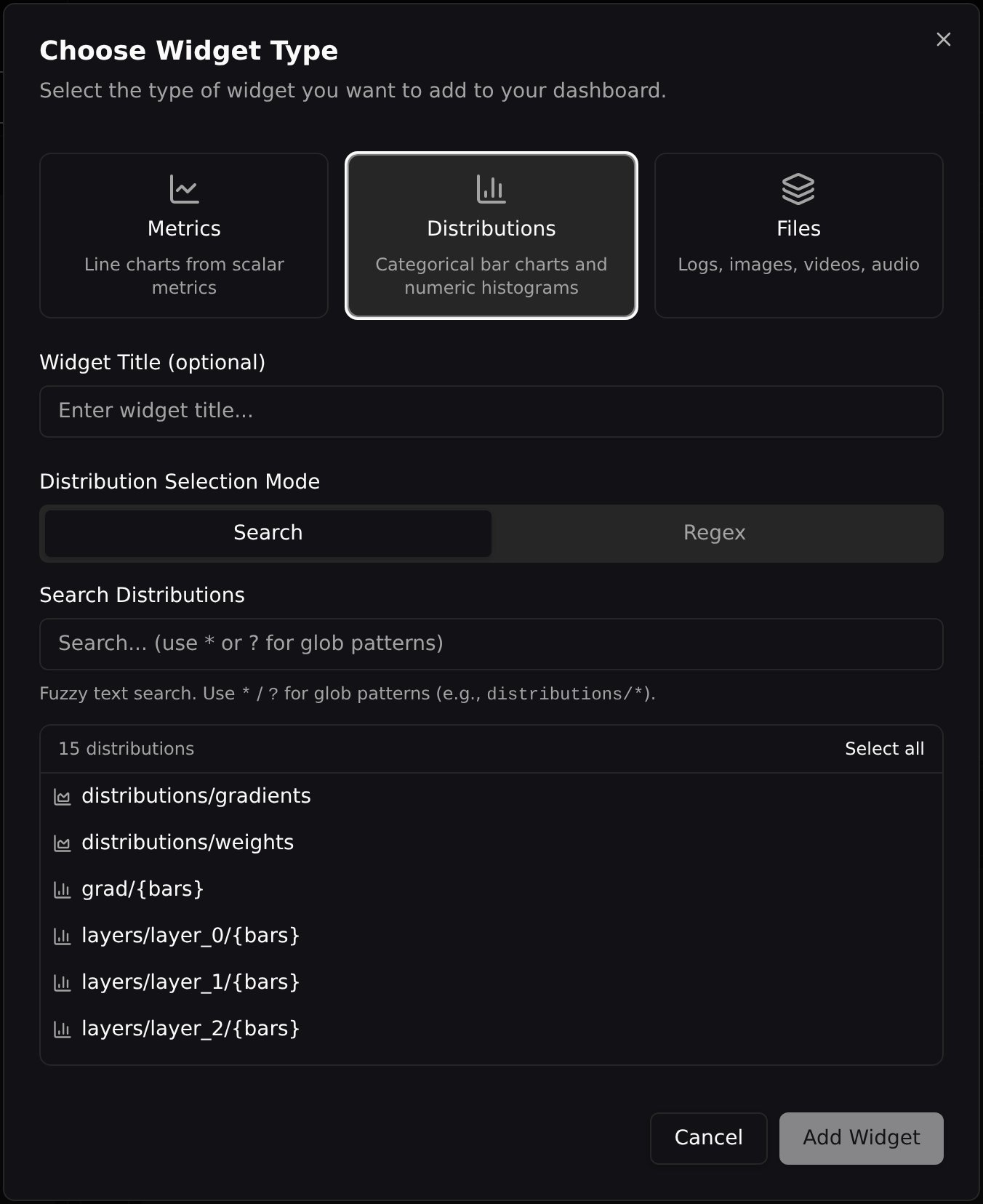
Histograms render in the Distributions widget, which also hosts categorical bar charts. To add one to a dashboard, open Add Widget, choose the Distributions tab, and search for your histogram log name (e.g.distributions/weights).
View modes
Each widget renders in one of three modes. Step — a bar chart of the current step’s frequencies. Use the step slider below the widget to scrub through training; when several widgets share a section, their sliders can be linked via the lock icon so they move together. Each step is drawn with its own bins and scaled to its own range — see Axis scaling.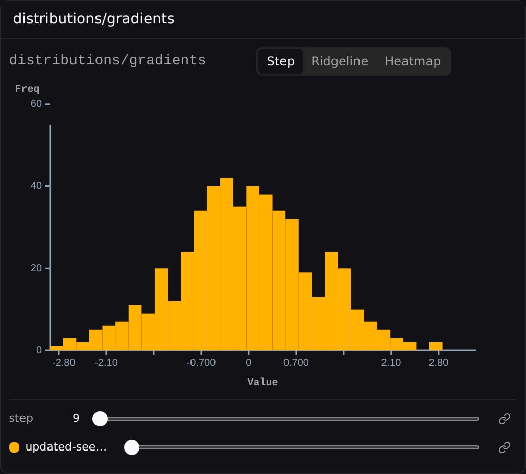
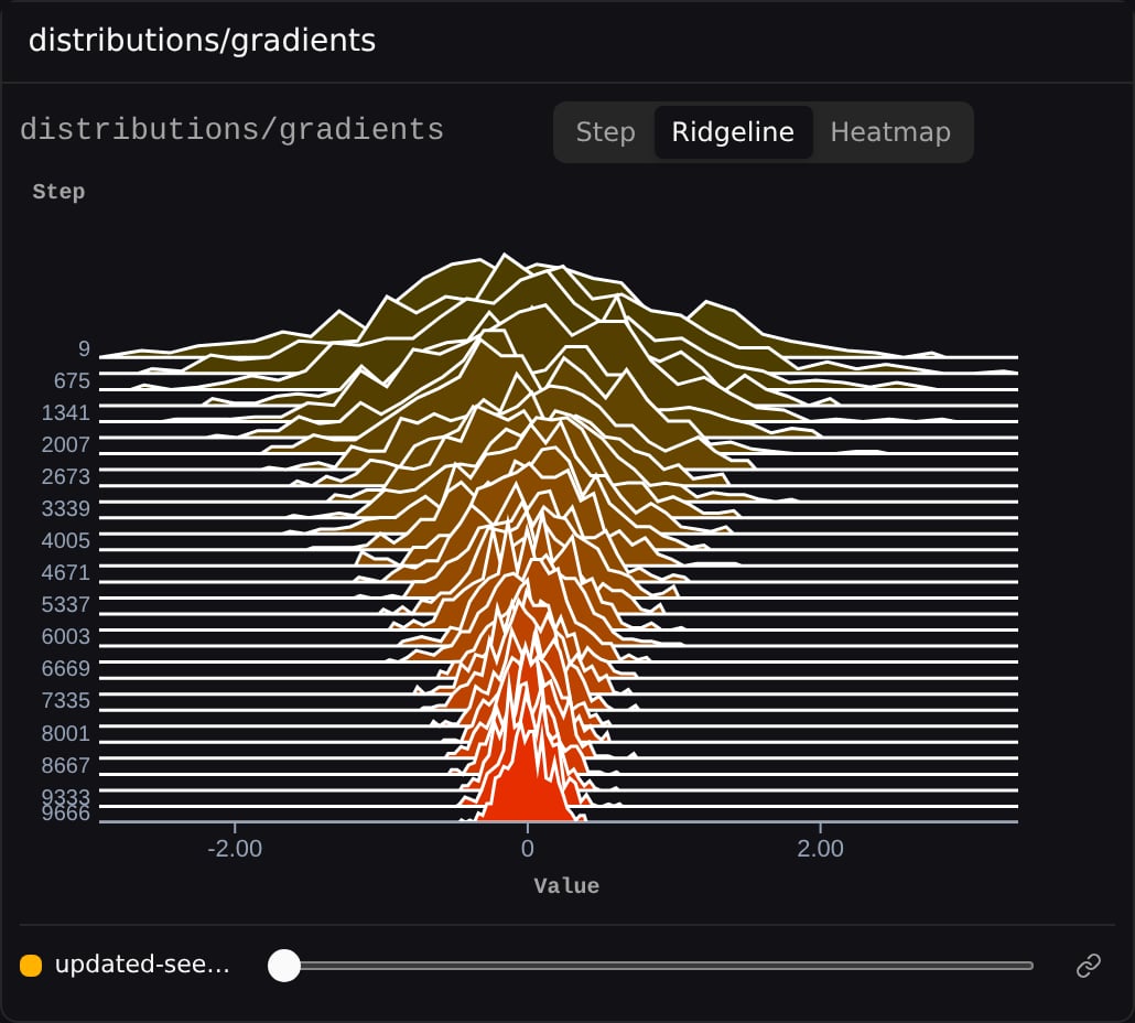
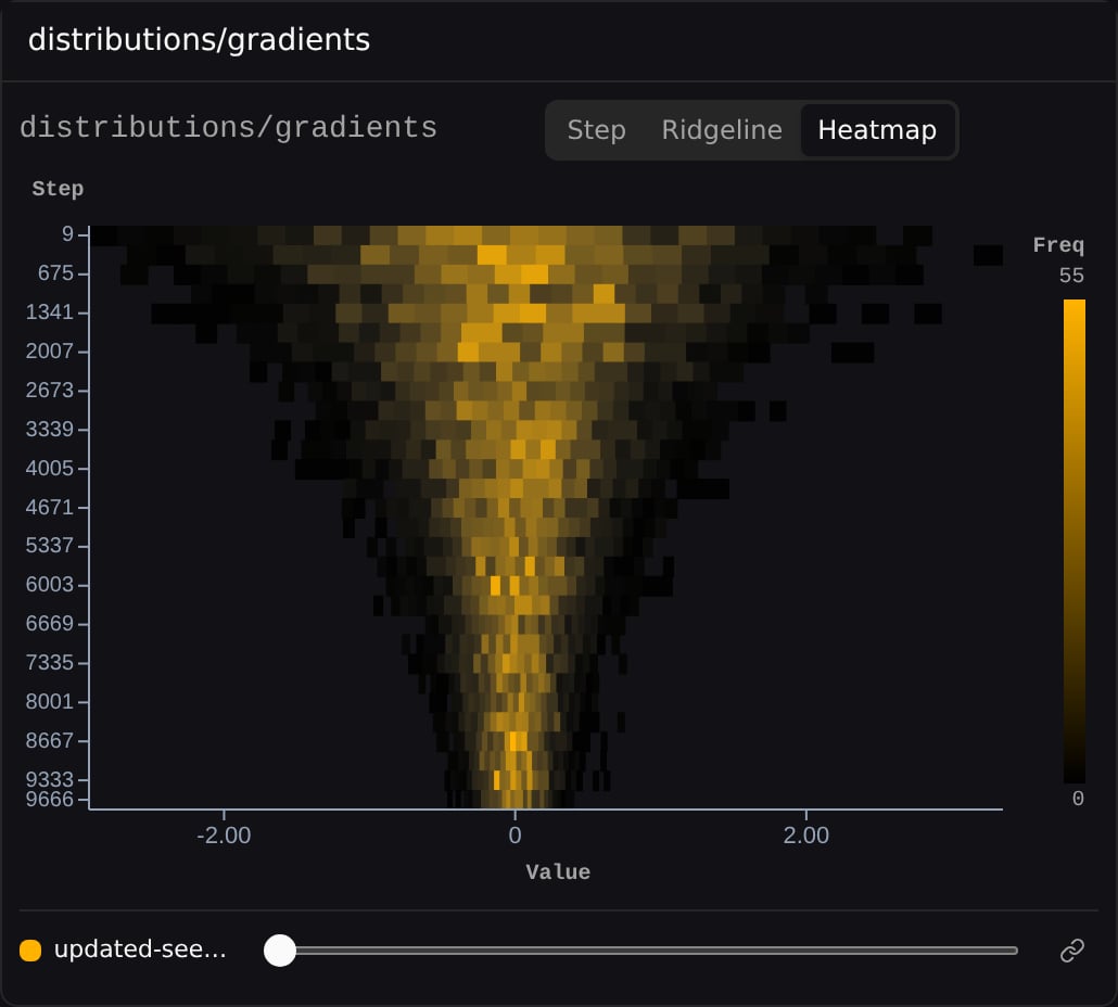
Steps on X
In Ridgeline and Heatmap modes, a Steps on X toggle in the settings popover transposes the chart so steps run along the X axis.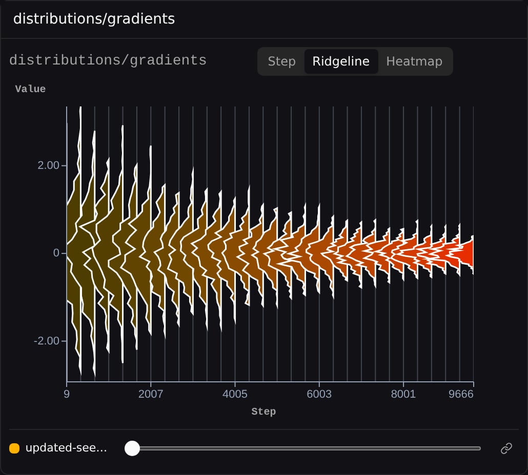
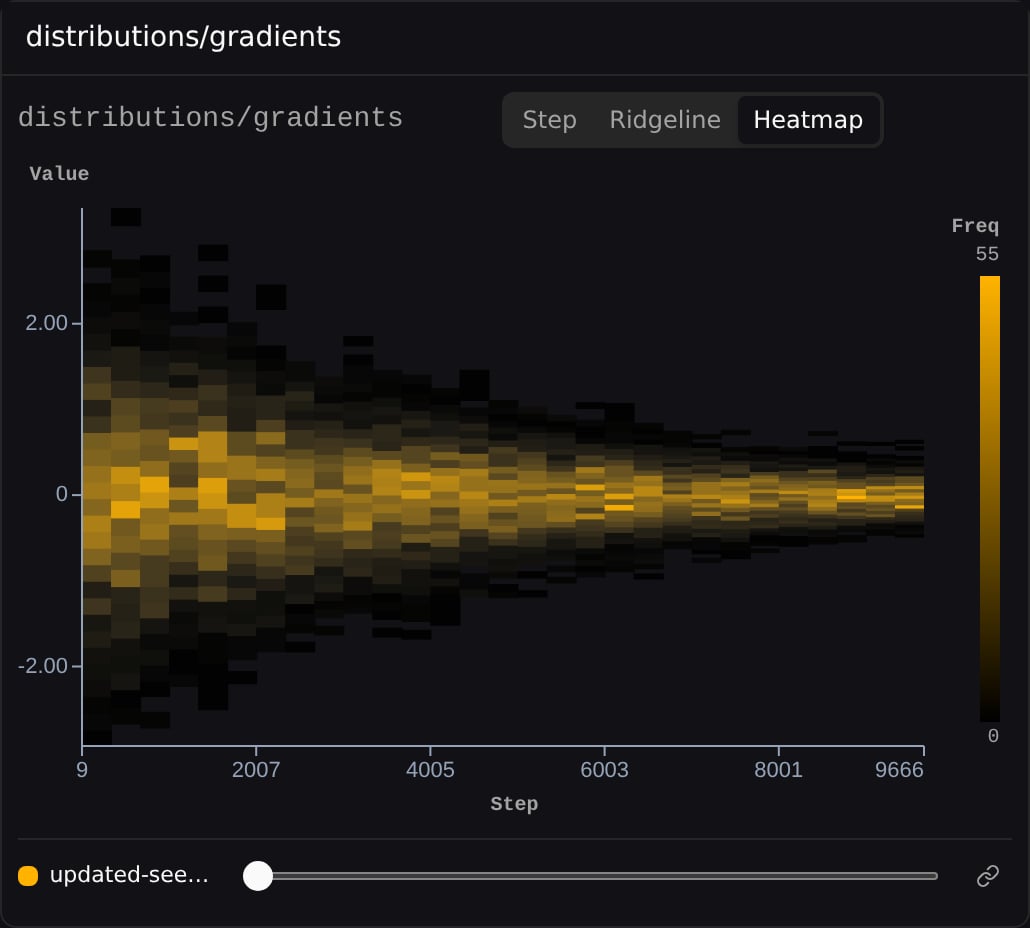
Axis scaling
In Step mode, each step is scaled to its own data by default: the X axis covers that step’s bin range (padded slightly on each side) and the Y axis is that step’s own peak frequency. Every step fills the frame, so you can read the shape of the distribution at each point in training. This matters when one step is much wider or taller than the rest. A single step whose values span0–2000, logged alongside steps that span -4–4, would otherwise stretch the shared X axis and squash every other step into an unreadable sliver at the origin — and one unusually tall step would flatten everything else on Y.
Lock axes across steps
To compare magnitude across steps rather than read each step’s shape, enable Lock axes across steps in the settings popover. All steps then share one X range and one Y peak, so bar heights are directly comparable from step to step. The toggle is Step mode only and off by default. It applies to the widget you set it on and is not saved with the dashboard. Here is the same step of the same run with the toggle off and then on. This run’s distribution widens over training, so an early step is narrow while later steps are far wider: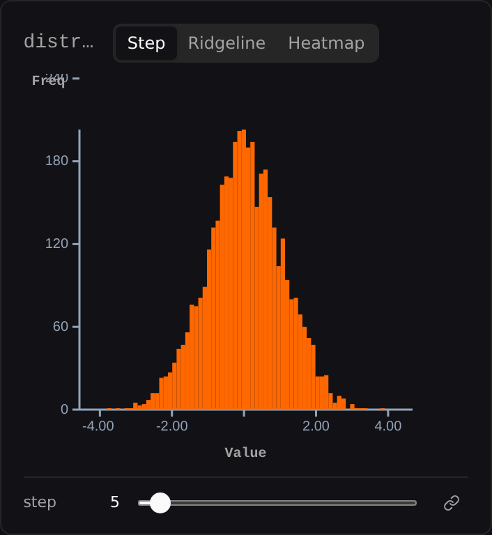
-4 to 4) and the Y axis tops out at its own peak, so the distribution fills the card and its shape is readable.
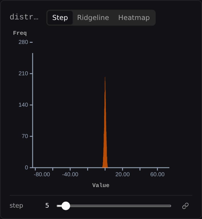
-80 to 80), so this step becomes a narrow spike at the origin. Its shape is no longer readable, but its height is directly comparable against every other step.
Ridgeline and Heatmap modes stack every step by design, so they always use the shared per-run range. Lock axes across steps and Y max don’t apply there.
Settings
Open the settings popover (the sliders icon, shown on hover) to adjust:
- X min / X max — pin the X axis to manual bounds instead of the per-run Auto range.
- Y max — manual Y bound (Step mode only).
- Lock axes across steps — share one X range and Y peak across all steps instead of scaling each step to its own data (Step mode only, off by default). See Axis scaling.
- Ignore outliers — clamp the axis and frequency scale so one extreme step doesn’t flatten the rest (on by default). Affects Ridgeline and Heatmap; in Step mode it only does something when Lock axes across steps is on.
Which setting wins
The three controls interact. When more than one applies, they resolve in this order:
A manual bound of
0 counts as a bound — it is not treated as “unset”.
When Ignore outliers actually clamps
It always applies in Ridgeline and Heatmap. In Step mode it only applies with Lock axes across steps on — per-step scaling leaves it nothing to clamp, so the toggle does nothing there. Even where it applies, the fence stays off unless a spike is genuinely dominating. All three must hold:- at least 20 steps to compute fences from
- the full range is more than 3× the fenced range
- at most 10% of steps fall outside the fenced range
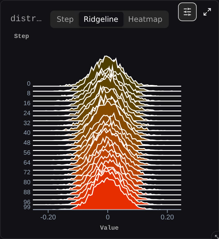
-0.20 to 0.20 range.
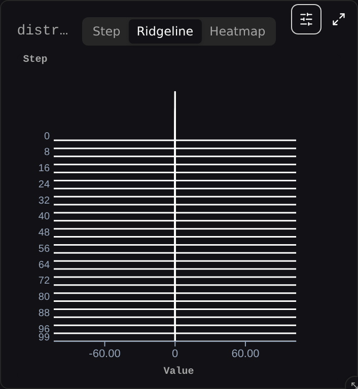
-60 to 60) and every step collapses to a flat line. Nothing is readable, including the outlier that caused it.