
Metric Groupings
Metrics recorded withpluto.log produces a point in a time series, where each time series is associated with a user defined metric label. Every invocation of pluto.log is implicitly associated with a particular step value which represents the x-axis while the logged metric value is the y-axis. Metrics should be labeled using path like syntax i.e.
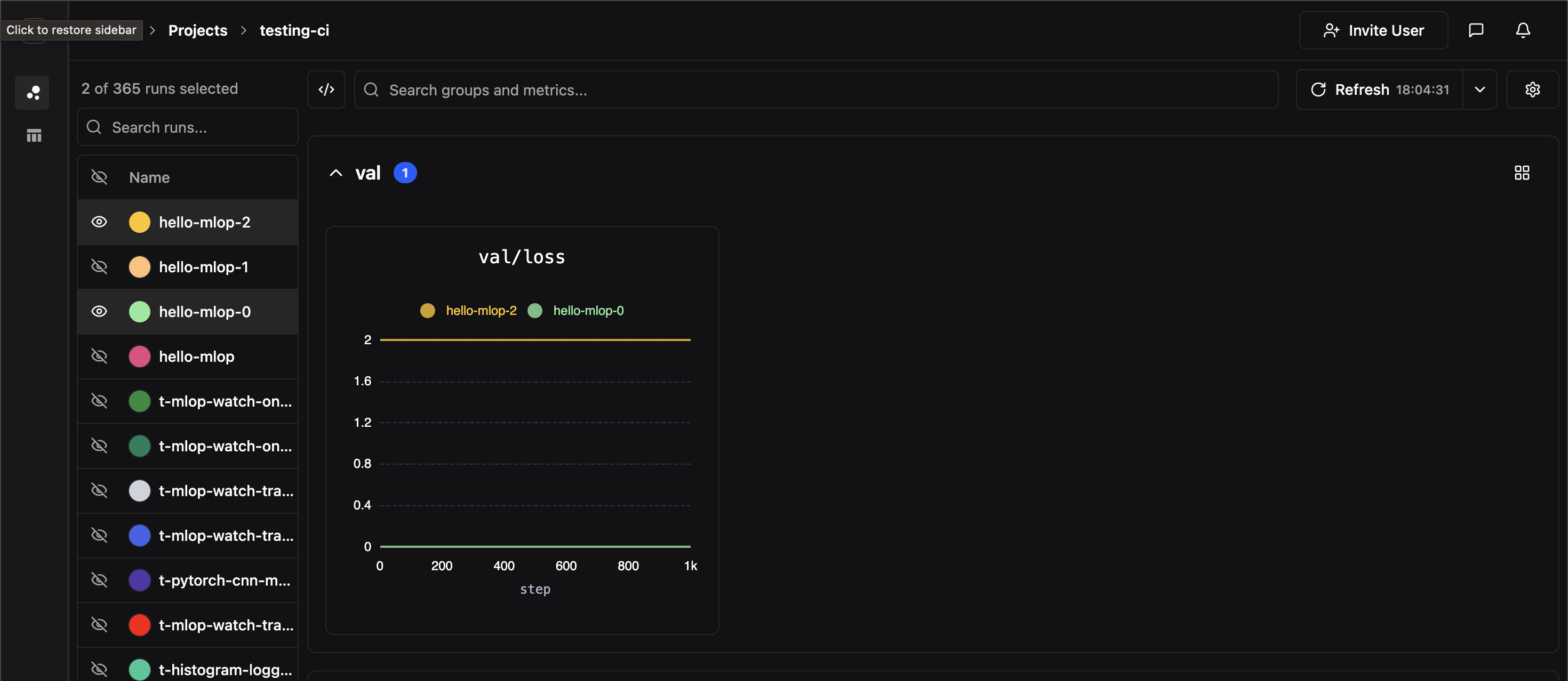
val), and each panel corresponds to a unique full metric label path. In the above example, we’ve created a panel for the metric label val/loss
Comparing Experiments
If two experiments have identically labeled time-series, their time series data will be co-plotted on the same panel. In the image below, we hide all of our experiments except for two which both contained time-series labeledval/loss
Side-by-Side View
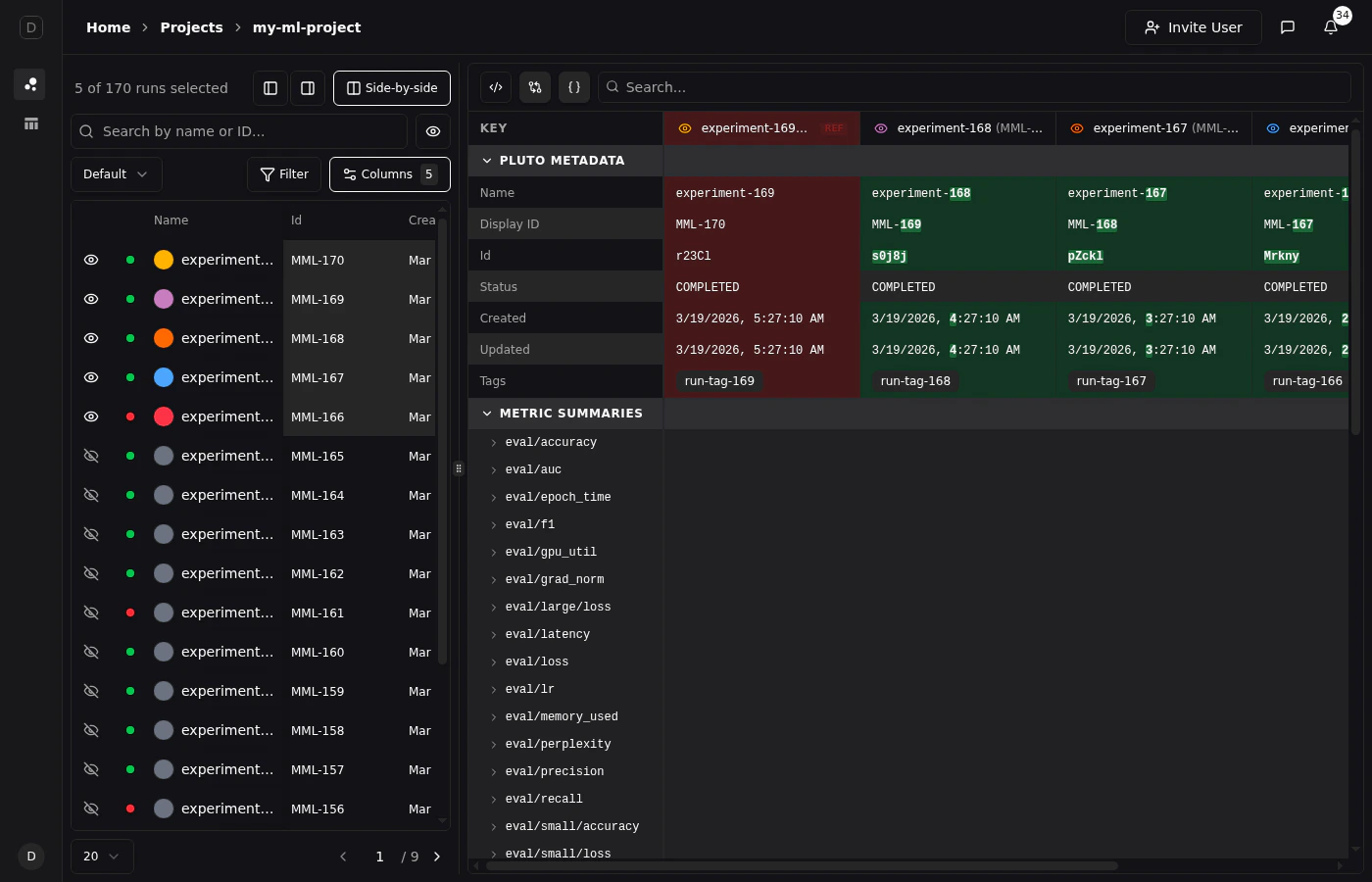
For a detailed tabular comparison of selected runs, click the Side-by-side button above the runs table. This opens a comparison view that displays all metadata and metric summaries in a structured table with one column per run.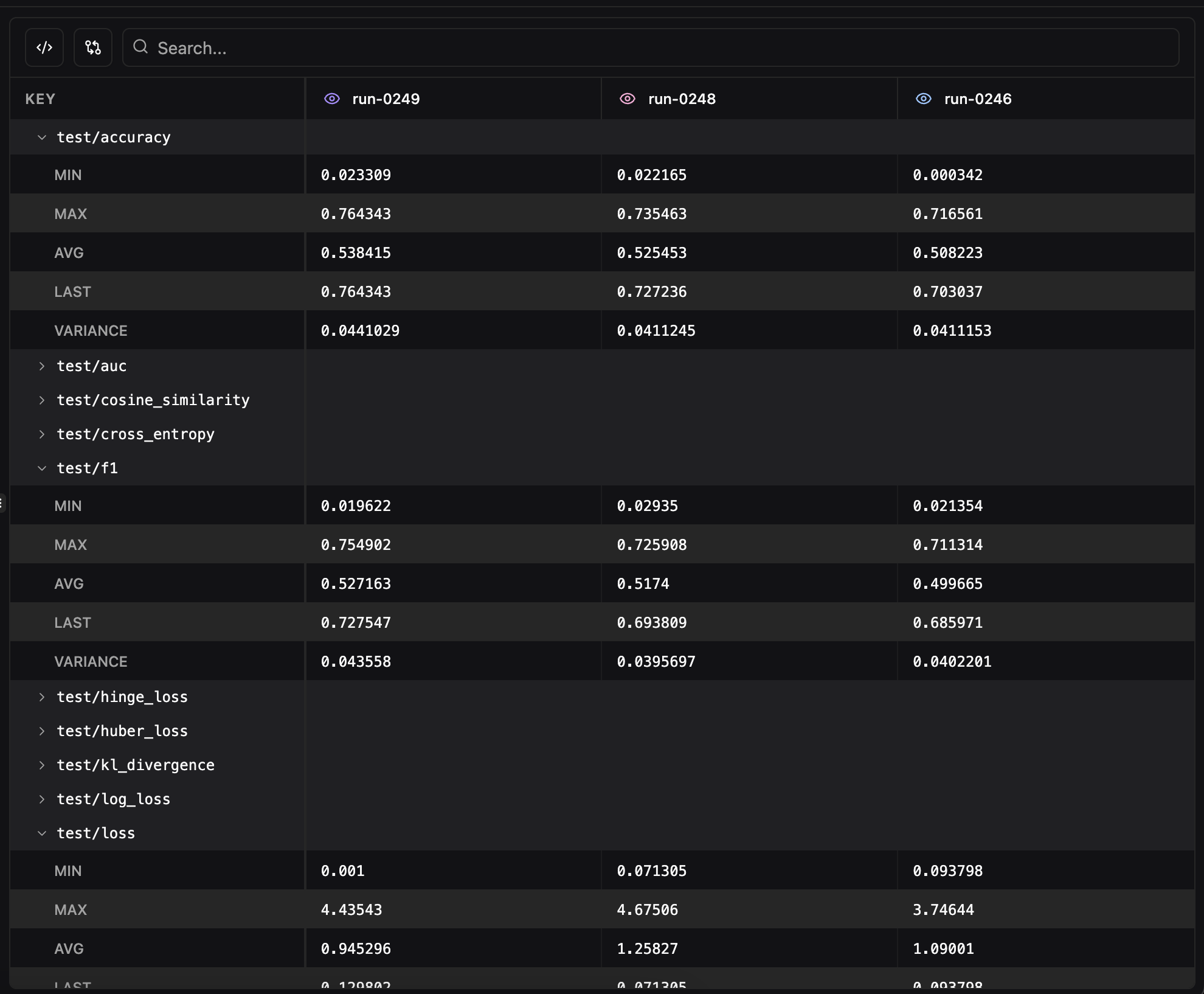
- Pluto Metadata — Name, ID, status, owner, timestamps, tags, and notes for each run
- Metric Summaries — Final values for every logged metric, organized alphabetically
- Search — Filter the comparison table by metric name with support for regex matching
- Remove from comparison — Click the eye icon on any run’s column header to temporarily hide it from the view
- Show only differences — Toggle to hide rows where all runs have identical values, making it easy to spot what changed between experiments
- Format JSON values — Toggle JSON pretty-printing for config values. JSON and Python dict values (single-quoted dicts,
True/False/None) are automatically detected and formatted with collapsible cells. Enabled by default.
Diff View
Click any run’s column header to set it as the reference run (indicated by a “REF” badge). With diff mode enabled, values are highlighted git-style:- Red background for the reference run’s values
- Green background for values that differ from the reference
Run Table Customization
The runs table at the top of the Compare view supports extensive customization to help you organize and analyze your experiments.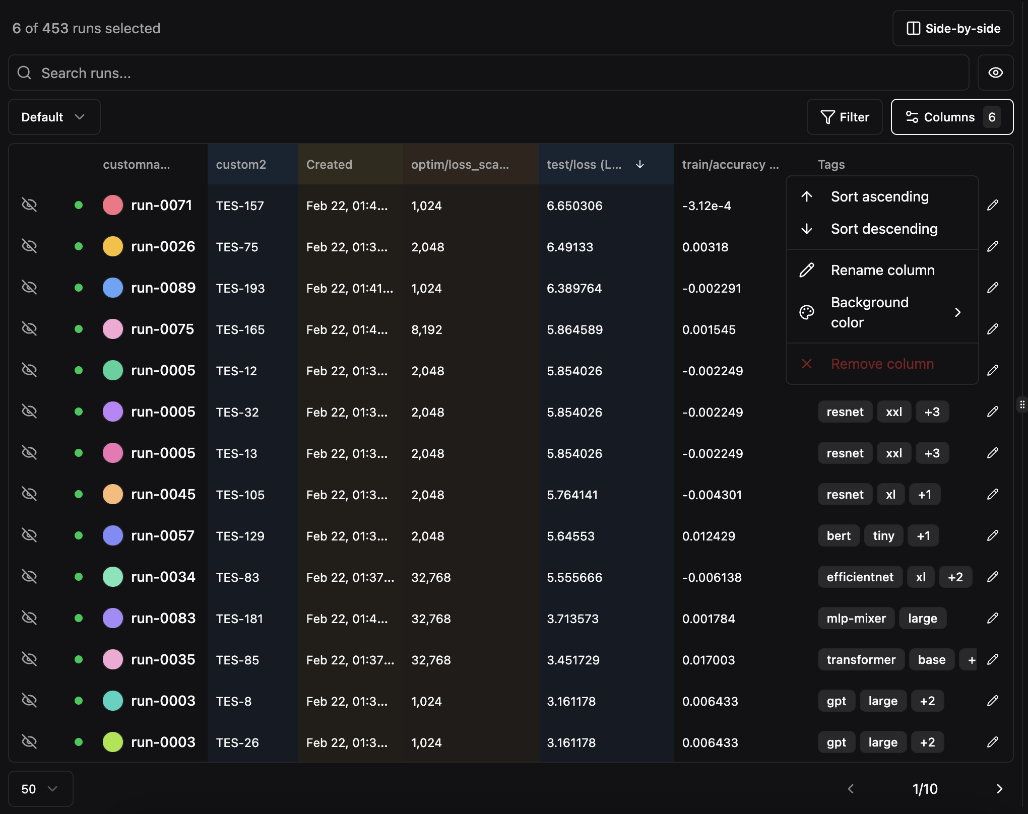
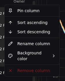
Column Header Menus
Right-click or click the menu icon on any column header to access options:- Sort ascending or descending
- Rename the column display name
- Set column color for visual grouping
- Pin column to the left or right side of the table to keep it visible during horizontal scrolling. The Select, Status, and Name columns are pinned by default.
Column Picker
Click the Columns button to choose which columns are visible in the runs table. The default columns are Name, Id, Created, Owner, Tags, and Notes, but you can add or remove any column.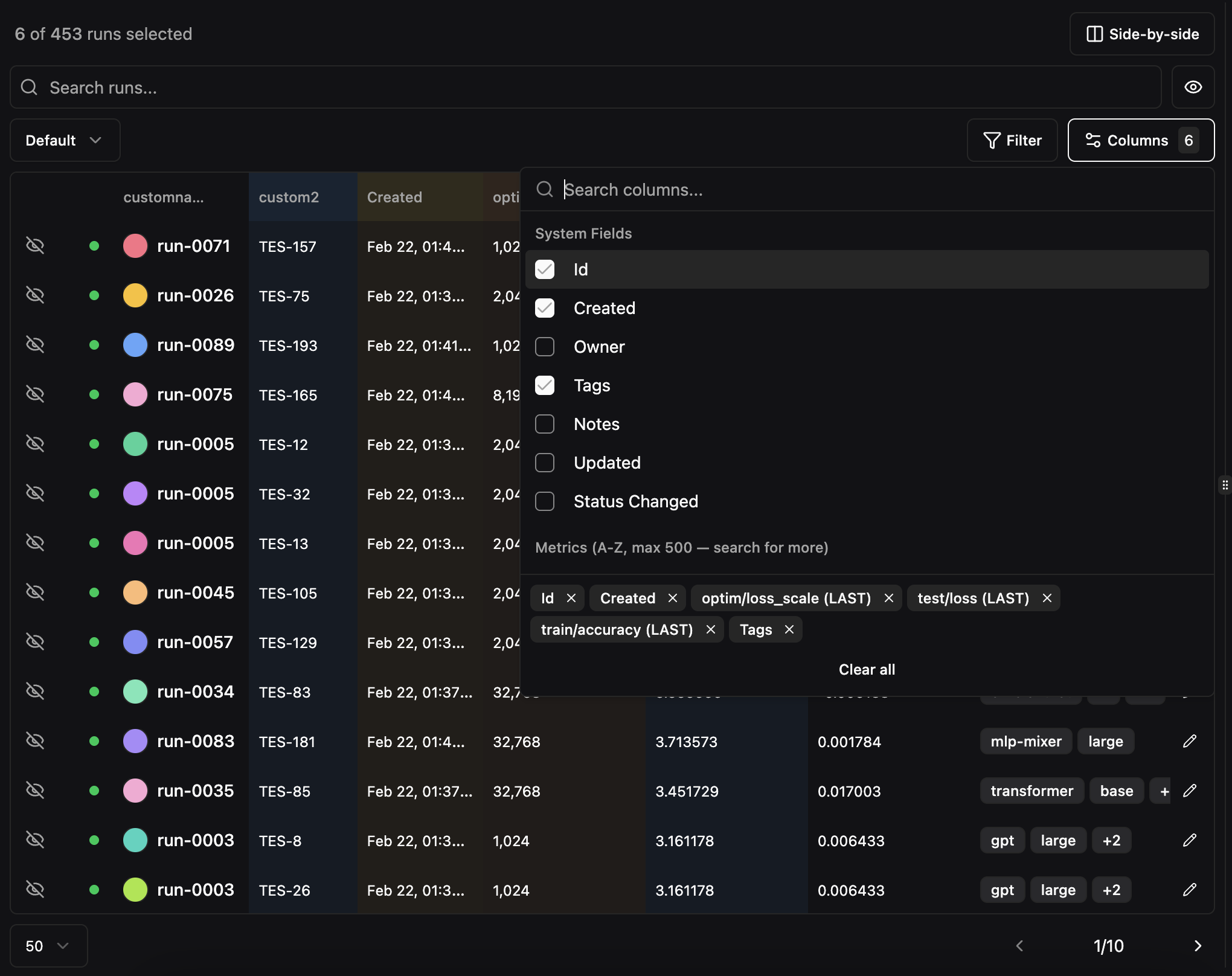
Run Visibility
Selecting a run adds it to your shortlist and shows it on charts. Sometimes you want to keep a run in your shortlist for reference but temporarily hide it from charts — for example, when a noisy run is obscuring trends you’re trying to compare. Each selected run has an eye icon in the leftmost column that controls its chart visibility independently from selection:- Select run — Click the eye icon on an unselected run to add it to your shortlist and show it on charts.
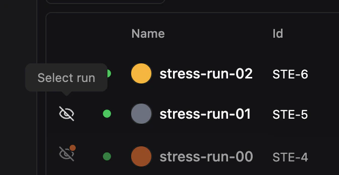
- Deselect run — Click the eye icon on a selected, visible run to fully deselect it, removing it from both the table shortlist and charts.
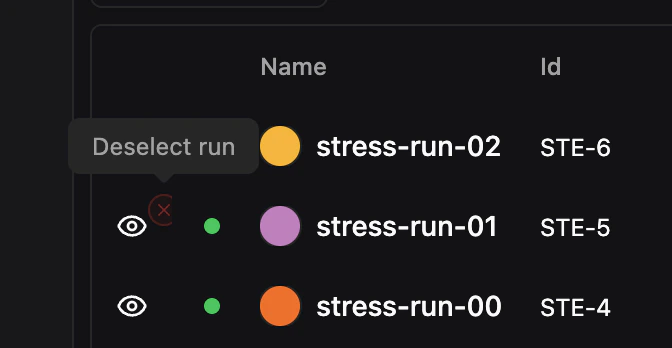
- Hide from charts — Click the X button (appears on hover) on a visible run to hide it from charts while keeping it selected in the table.
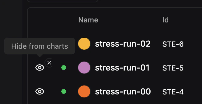
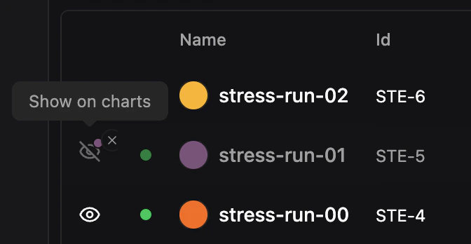
- Show on charts — Click the eye icon on a hidden run to make it visible on charts again.
?hidden= parameter for shareable links.
To manage visibility in bulk, use the visibility dropdown above the table:
- Show all on charts — Make all selected runs visible on charts
- Hide all from charts — Hide all selected runs from charts while keeping them selected
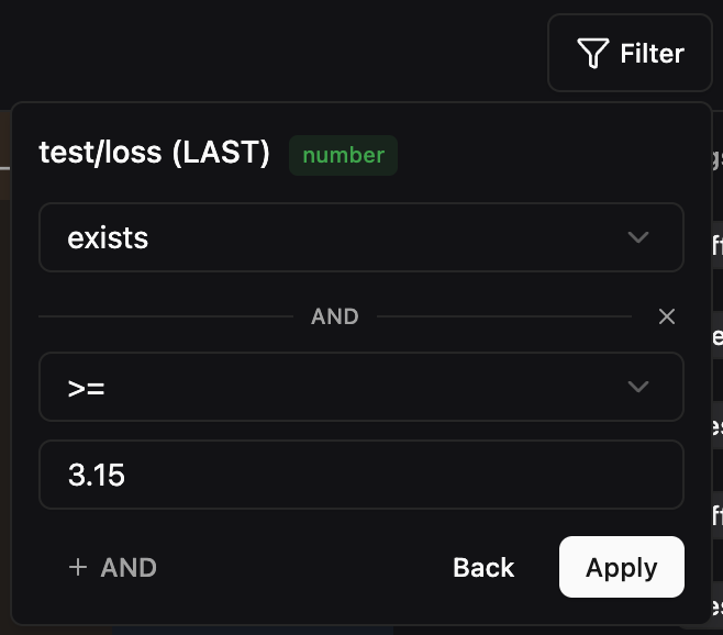
Filtering and Sorting
Click the Filter button to open the filter dropdown. The filter system is type-aware, offering different operators depending on the column type.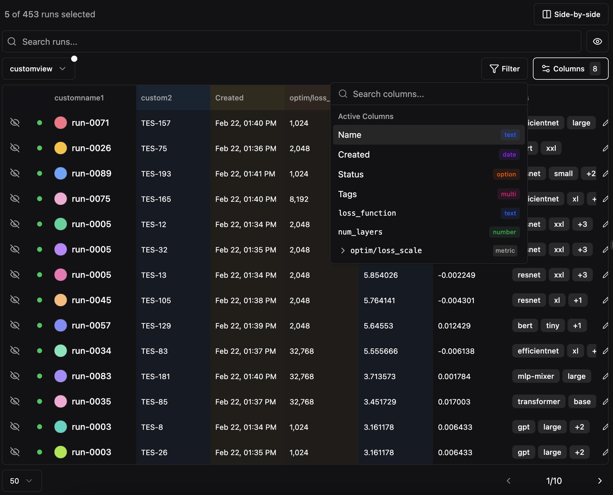
Preset Views
Save your table configuration (visible columns, column order, filters, and sort settings) as a named preset view. This is useful for creating reusable perspectives on your data, such as “Training Metrics Only” or “Best Runs”.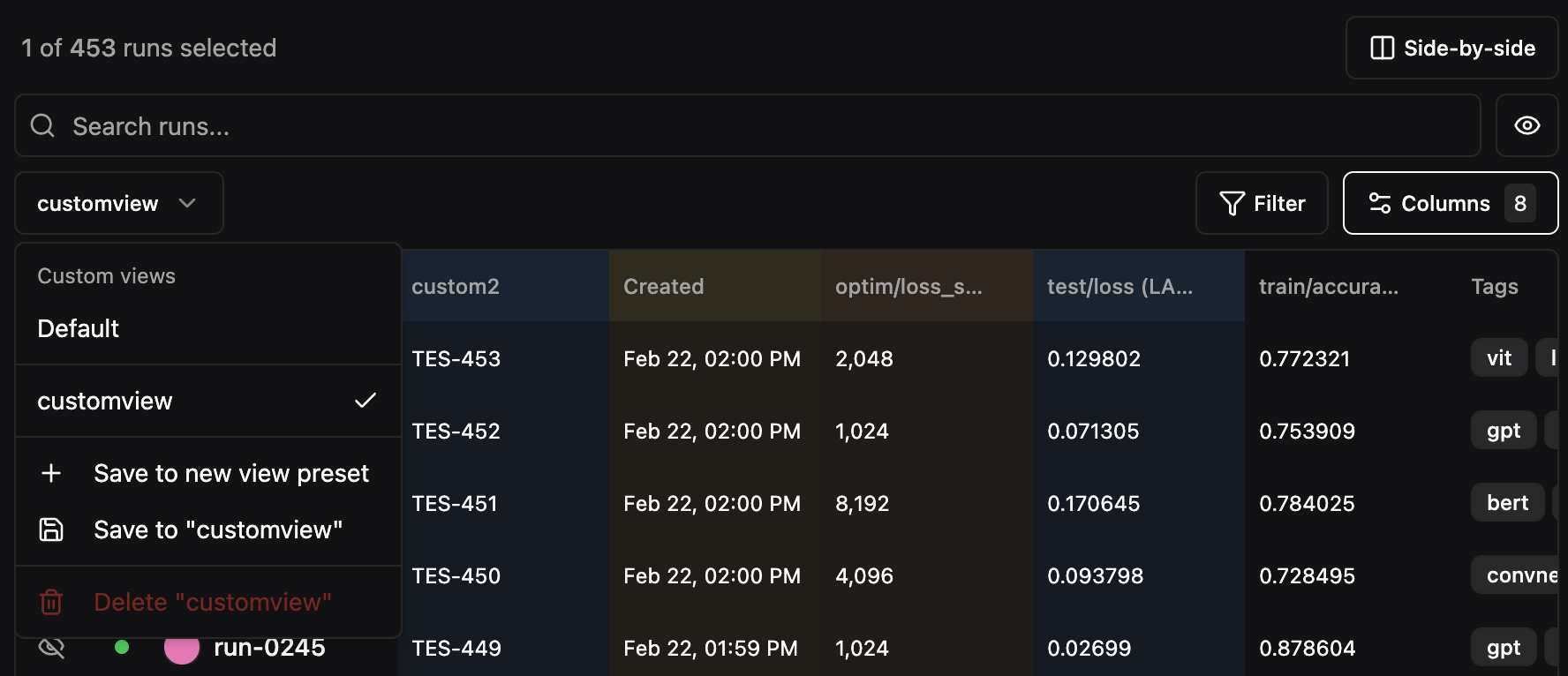
- Configure the table with the columns, filters, and sort order you want
- Click the view selector dropdown (shows “Default” by default)
- Select Save to new view preset
- Enter a name for the preset
Pagination
The runs table paginates when there are more runs than fit on a single page. Use the page size dropdown to choose how many runs to display per page (default: 20). The page indicator (e.g.,1 / 9) is an editable input — click on the current page number and type a page number directly to jump to any page without clicking through next/previous.