Overview
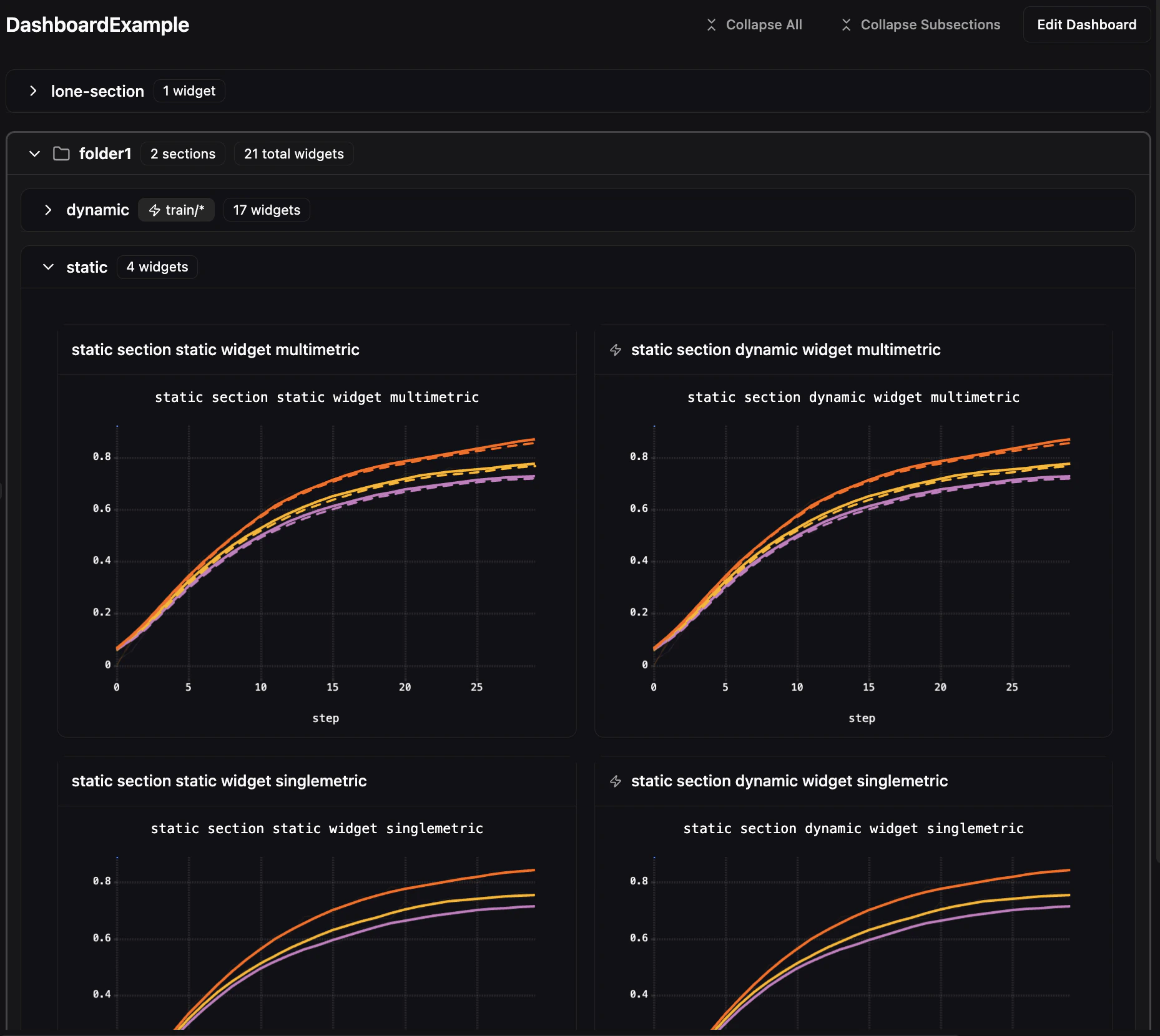
Dashboards are created at the project level and are shared across your organization. Each dashboard is organized using folders, sections, and widgets:- Folders — Optional top-level containers that can hold sections, widgets, or both.
- Sections — Collapsible containers that hold widgets. Sections can live at the top level or inside a folder.
- Widgets — The individual visualizations (line charts, histograms, images, videos, audio, console logs). Widgets can live inside sections or directly inside folders.
Creating a Dashboard
- Navigate to any project’s Compare tab
- Click the Dashboards dropdown in the toolbar
- Select Create New Dashboard
- Enter a name for your dashboard and click Create
Editing a Dashboard
Click Edit Dashboard to enter edit mode. In edit mode you can:- Add, remove, and reorder sections via drag and drop — grab the grip handle on any section header and drag it to a new position. A blue drop indicator shows where the section will be placed.
- Add widgets to sections
- Copy and paste widgets — Right-click any widget to access Copy Widget in the context menu. A Paste Widget button then appears in section headers, letting you duplicate widgets across sections.
- Move widgets — Right-click any widget and select Move to… to move it to a different section. The submenu lists all non-dynamic sections, including those inside folders.
- Choose between Grid and Free layout modes
- Save or Cancel your changes
Auto-Save and Draft Recovery
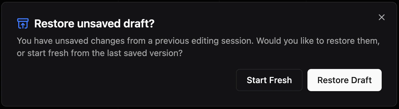
Dashboard edits are automatically saved as drafts to your browser. If you navigate away with unsaved changes, a confirmation dialog warns you before leaving. If you close the tab accidentally, your draft is preserved — a recovery dialog appears the next time you enter edit mode, letting you restore your work.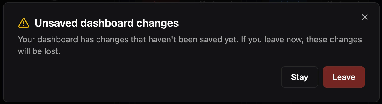
Concurrency Control
When editing a dashboard, Pluto polls for remote changes every 30 seconds. If another user modifies the dashboard while you are editing, a stale warning appears with two options:- Save as new — Save your changes as a new dashboard
- Override — Overwrite the remote changes with your version
Folders
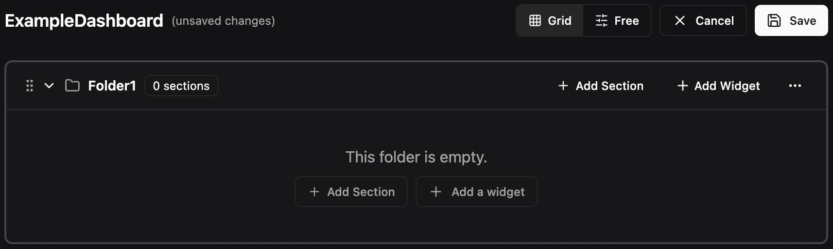
Folders provide an optional top-level grouping layer for organizing related content. A folder can contain child sections, widgets, or both. Sections do not need to be inside folders — they can also live at the top level of a dashboard on their own. Similarly, folders can hold widgets directly without any child sections.Creating a Folder
Click New Folder in the dashboard toolbar to create a folder. Give it a name and it will appear as a top-level container with a folder icon and a tinted border to distinguish it from regular sections.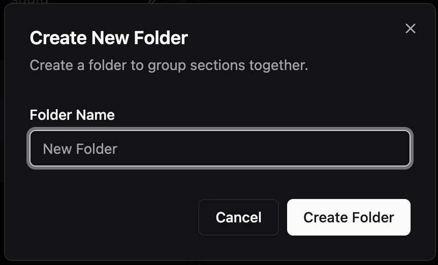
Adding Sections to Folders
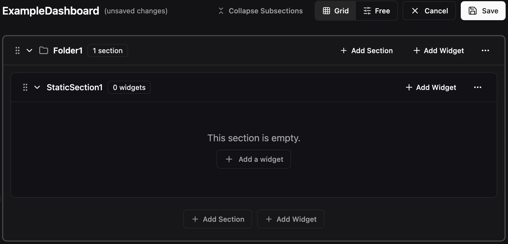
There are two ways to add sections to a folder:- Create a new section — Click the Add Section button to create a new section directly inside the folder.
- Move an existing section — Move a top-level section or a section from another folder into the folder. You can do this in two ways:
- Drag and drop — Drag any section by its grip handle and drop it into the folder. An indicator shows the drop target.
- Move to… menu — Use the ••• dropdown menu on a section header and select Move to… to pick the destination folder.
Adding Widgets to Folders
Widgets can be added directly to a folder without needing a child section. There are two ways:- Create a new widget — Click Add Widget on the folder itself to open the widget type picker.
- Move an existing widget — Use the ••• dropdown menu on an existing widget and select Move to… to pick the folder as the destination.
Sections
Sections are collapsible containers that hold widgets. They can live at the top level of a dashboard or inside a folder. Each section has a name, can be collapsed or expanded, and can optionally use a dynamic pattern to auto-populate its widgets.Creating a Section
Click New Section to create a section. Each section has a name that appears in the section header.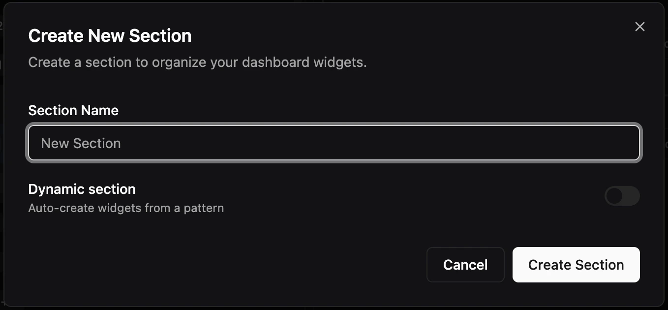
Adding Widgets to Sections
There are two ways to add widgets to a section:- Create a new widget — Click Add Widget inside the section to open the widget type picker.
- Move an existing widget — Use the ••• dropdown menu on an existing widget and select Move to… to pick the section as the destination.
Widgets
Widgets are the individual visualizations inside sections or folders. There are two types of widgets: Metrics and Files.Creating a Widget
Click Add Widget inside any section or folder to open the widget type picker: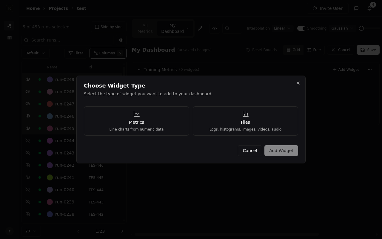
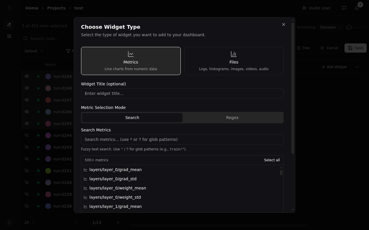
Metrics Widgets
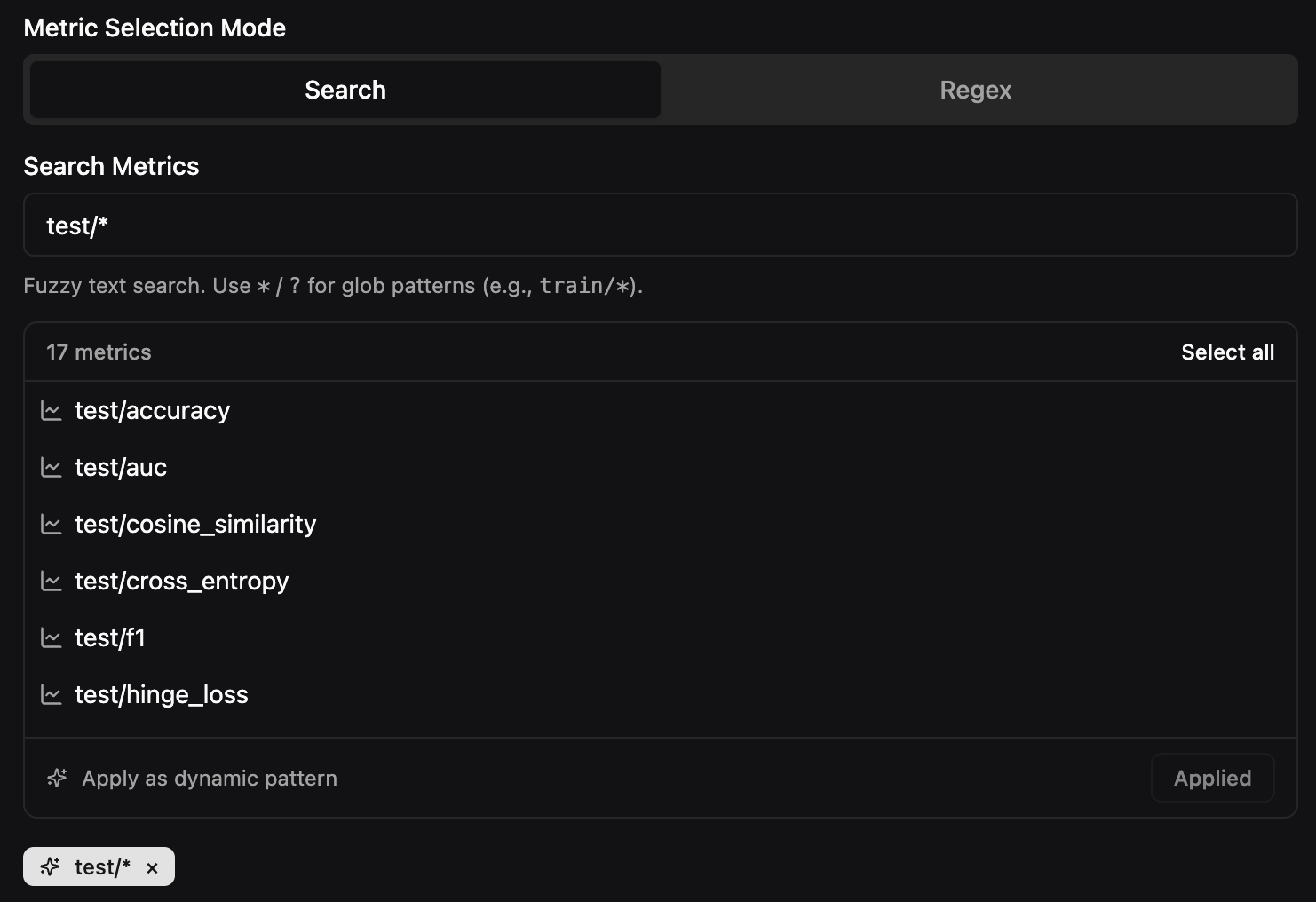
Select Metrics to create a line chart widget. You can:- Select multiple metrics to plot them on a single chart — each metric gets a distinct dash pattern for differentiation
- Search for metrics using fuzzy text search or glob patterns (e.g.,
train/*) - Switch to Regex mode for precise pattern matching
- Configure the X-Axis (Step, Relative Time, Absolute Time, or any custom metric), Aggregation (Last, Min, Max, Mean), and Y-Axis Scale (Linear or Log)
train/loss and val/loss on the same axis).
Manually selected metrics are static — the chart always shows exactly the metrics you picked, regardless of what new data appears. For automatic discovery of new metrics, see Dynamic Content below.
File Widgets
Select Files to add widgets for non-numeric data:- Histograms — Distribution visualizations with step navigation
- Images — Training visualizations, sample outputs, etc.
- Videos — Recorded training episodes or generated content
- Audio — Audio samples or generated speech
- Console Logs — Stdout/stderr from your runs with search and ANSI color support
Searching Widgets
Use the search bar at the top of the dashboard to filter widgets by name. Matches against widget titles and metric names with substring matching.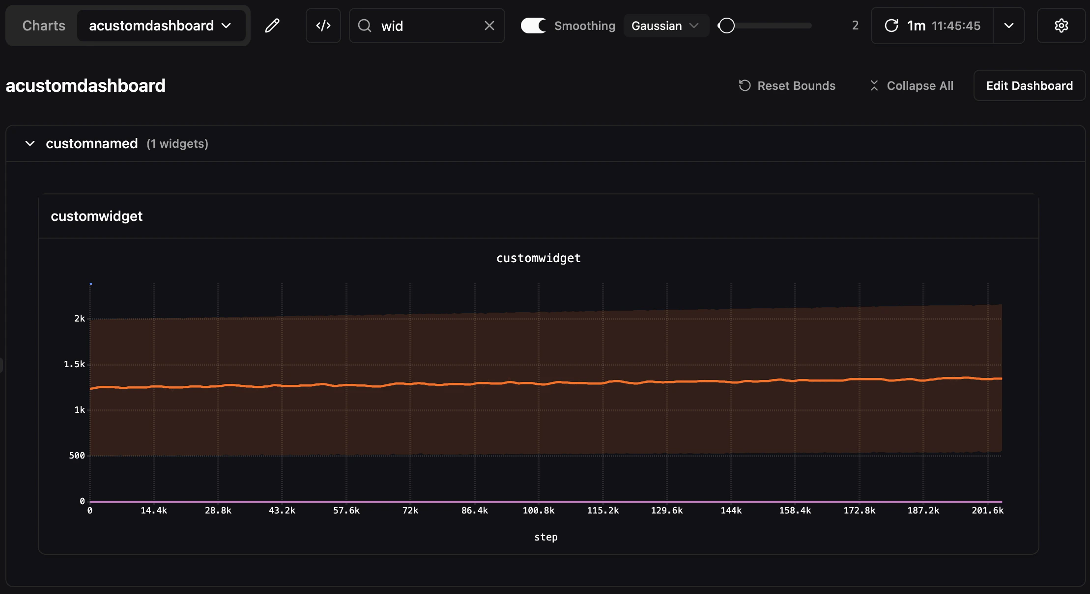
Dynamic Content
Sections and widgets can be made dynamic, meaning they use a glob or regex pattern to automatically discover and display matching data. When new metrics or files appear that match the pattern, they are included automatically.Dynamic Sections
Toggle Dynamic section when creating a section to auto-populate it with widgets from a pattern. A dynamic section creates one widget per match, automatically choosing the correct widget type for each.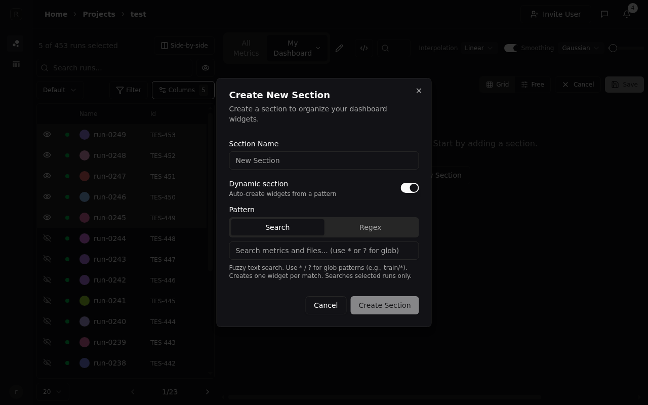
data/ prefix:
data/loss(metric)data/accuracy(metric)data/sample_audio(audio file)data/confusion_matrix(histogram)data/predictions(video)
data/* will create 5 separate widgets — one for each match — automatically choosing the correct widget type (line chart, audio player, histogram, video player) for each.
As new data appears under the matched pattern, the section updates automatically. For example, if a new run logs data/f1_score, a 6th widget appears without any manual configuration.
Dynamic Widgets
When you use a glob pattern liketrain/* in a widget, the widget becomes dynamic — it automatically includes any matching data on a single widget. Unlike manually selecting multiple metrics (which is static), a dynamic widget will pick up new data as it appears.
train/loss1 through train/loss5, logged across your runs. A dynamic Metrics widget with the pattern train/* will plot all 5 metrics on one chart. If a new metric like train/loss6 is logged, it is automatically added to the same chart when the corresponding run is selected as visible.
Because widgets are separated by data type, a dynamic Metrics widget only matches numeric time-series data. If you also have files under the same prefix, you would need a separate dynamic Files widget to display those.
Dynamic Sections vs Dynamic Widgets
Both use glob/regex patterns to automatically include matching data, but they differ in how matches are displayed:| Dynamic Section | Dynamic Widget | |
|---|---|---|
| Layout | One widget per match (separate charts) | All matches in one widget (single chart) |
| Data types | Cross-type — metrics and files in one section | Single type — metrics or files, not both |
| Use case | Overview of everything under a prefix | Comparing related metrics on one axis |
train/loss, train/accuracy, train/sample_image, and train/audio_clip.
- A dynamic section with
train/*creates 4 widgets — a line chart for loss, a line chart for accuracy, an image widget, and an audio widget - A dynamic Metrics widget with
train/*creates 1 chart with loss and accuracy plotted together (the image and audio are not shown — you’d need a separate dynamic Files widget for those)
Constraints
Folders- Folders cannot be nested — you cannot place a folder inside another folder.
- Folders cannot be dynamic — only sections can use dynamic patterns to auto-populate widgets.
- The dashboard search bar only searches widgets — folders and sections cannot be searched by name.
- Widgets cannot be dragged outside their parent section or folder. To move a widget to a different section or folder, use the ••• dropdown menu and select Move to….
- Each line chart widget has a configurable max series limit (default: 500). When exceeded, a warning is displayed instead of the chart. This can be adjusted in the line chart settings.
Saving and Loading
Click Save to persist your dashboard. Dashboards are saved per-project and shared across all members of your organization. Anyone with access to the project can view and edit dashboards. Switch between dashboards using the Dashboards dropdown in the toolbar. Click Charts to return to the default view showing all metrics grouped automatically.Exporting a Dashboard
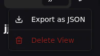
Click the dashboard menu and select Export JSON to download the full dashboard configuration as a JSON file. Share exported JSON files with teammates or keep them as backups. To import, use the Import JSON tab when creating a new dashboard.