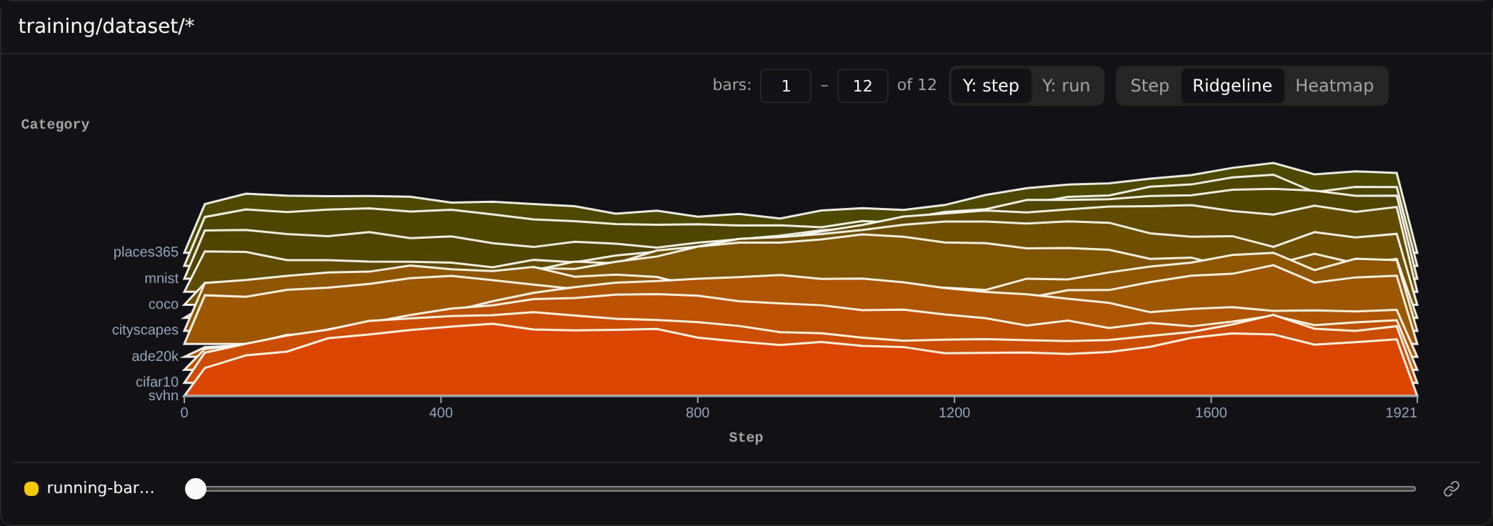
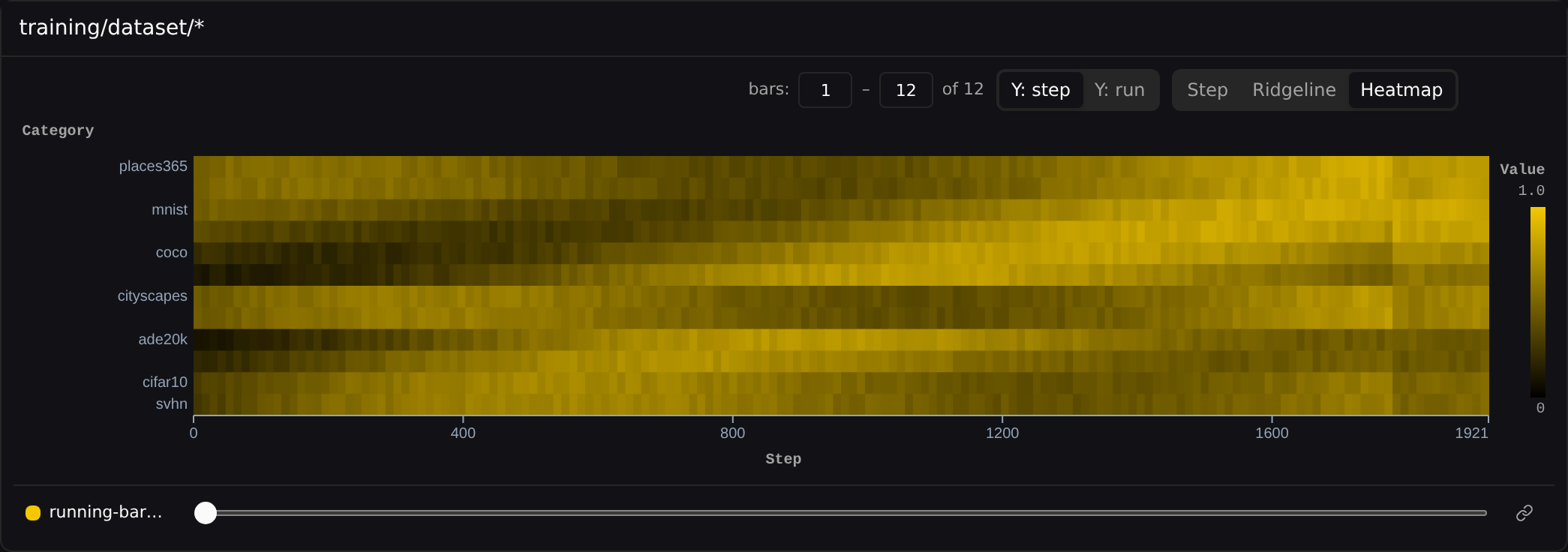
{bars} rollups let you compare many related scalars — per-class accuracy, per-shard throughput, per-expert load — as a single distribution instead of dozens of overlapping line charts.
Producing bar charts
Log three or more sibling scalars under a common prefix and Pluto automatically offers that prefix as a{bars} rollup — no special SDK call needed:
eval/per_class prefix and surfaces it as eval/per_class/{bars}. If you control the SDK and want true binned distributions, pluto.Histogram is the richer option.
Viewing
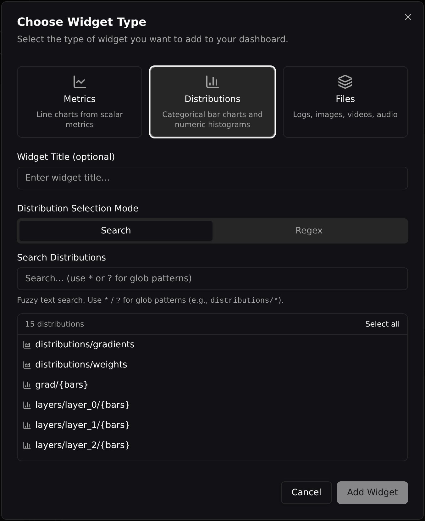
Bar charts live in the Distributions widget alongside numeric histograms. To add one, open Add Widget, choose the Distributions tab, and search for your<prefix>/{bars} group.
View modes
Each widget renders in one of three modes. Step — a bar chart at the scrubbed step, bars sorted by global max value. Use the step slider below the widget to scrub through training.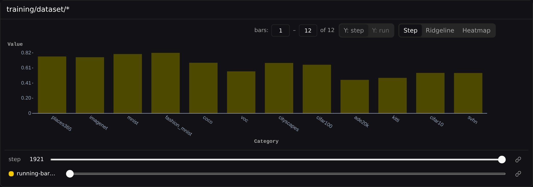
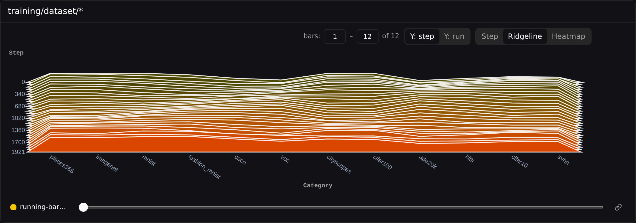
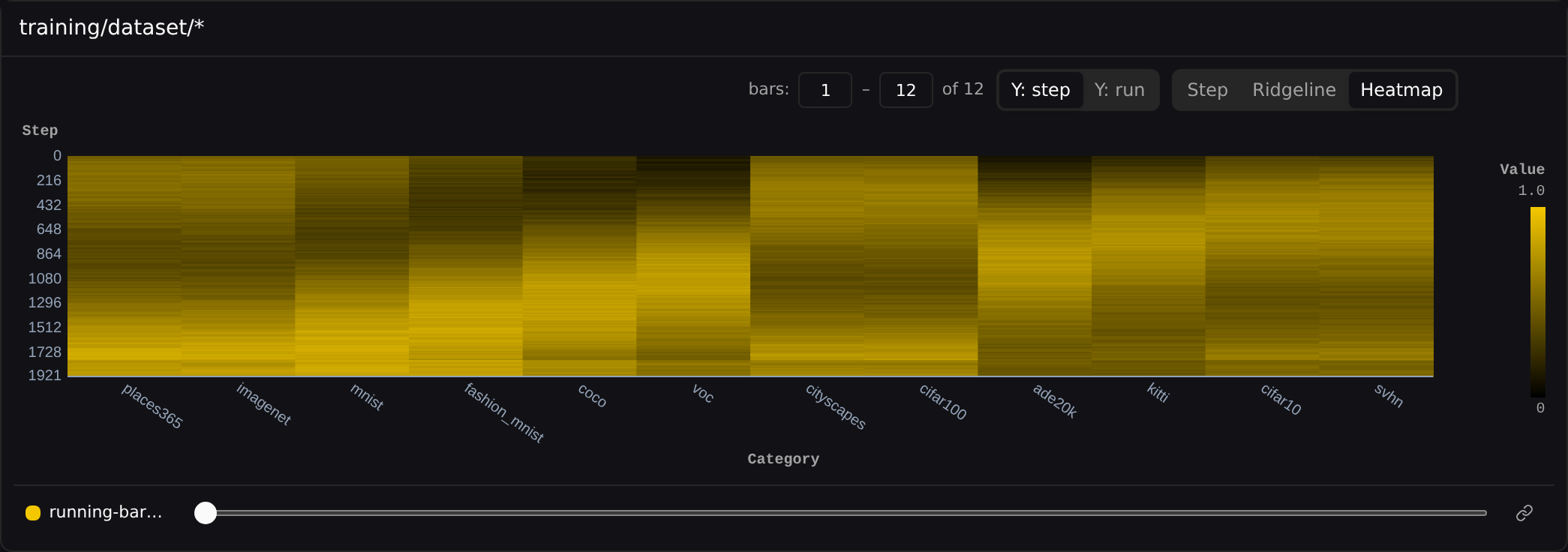
Y: step / Y: run toggle switches whether ridges and heatmap rows are stacked by step or by run.
Steps on X
In Ridgeline and Heatmap modes, the Steps on X toggle transposes the chart so training steps run along the X axis and categories stack down the Y axis. A{bars} heatmap aligns its X range with the line chart above it, so a metric and its distribution read as one coordinated view across time.