Skip to main contentMetric Groupings
Metrics recorded with run.log produces a point in a time series, where each time series is associated with a user defined metric label. Every invocation of run.log is implicitly associated with a particular step value which represents the x-axis while the logged metric value is the y-axis. Metrics should be labeled using path like syntax i.e.
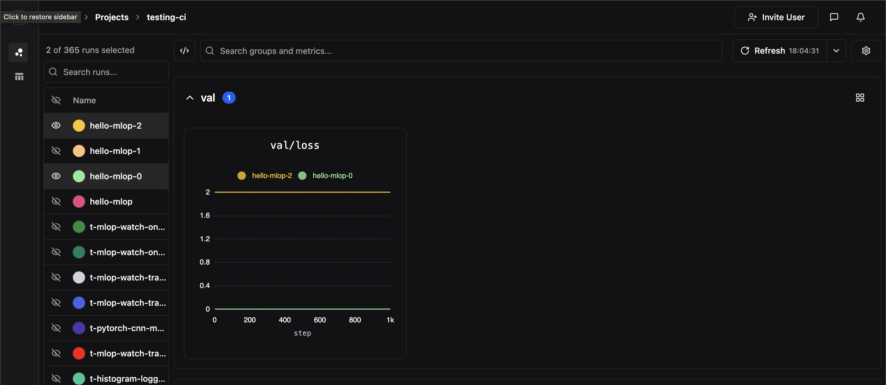
In the dashboard, metrics are grouped in the dashboard by their top-most parent key (in the example above, the topmost key would be val), and each panel corresponds to a unique full metric label path. In the above example, we’ve created a panel for the metric label val/loss
Comparing Experiments
If two experiments have identically labeled time-series, their time series data will be co-plotted on the same panel. In the image below, we hide all of our experiments except for two which both contained time-series labeled val/loss